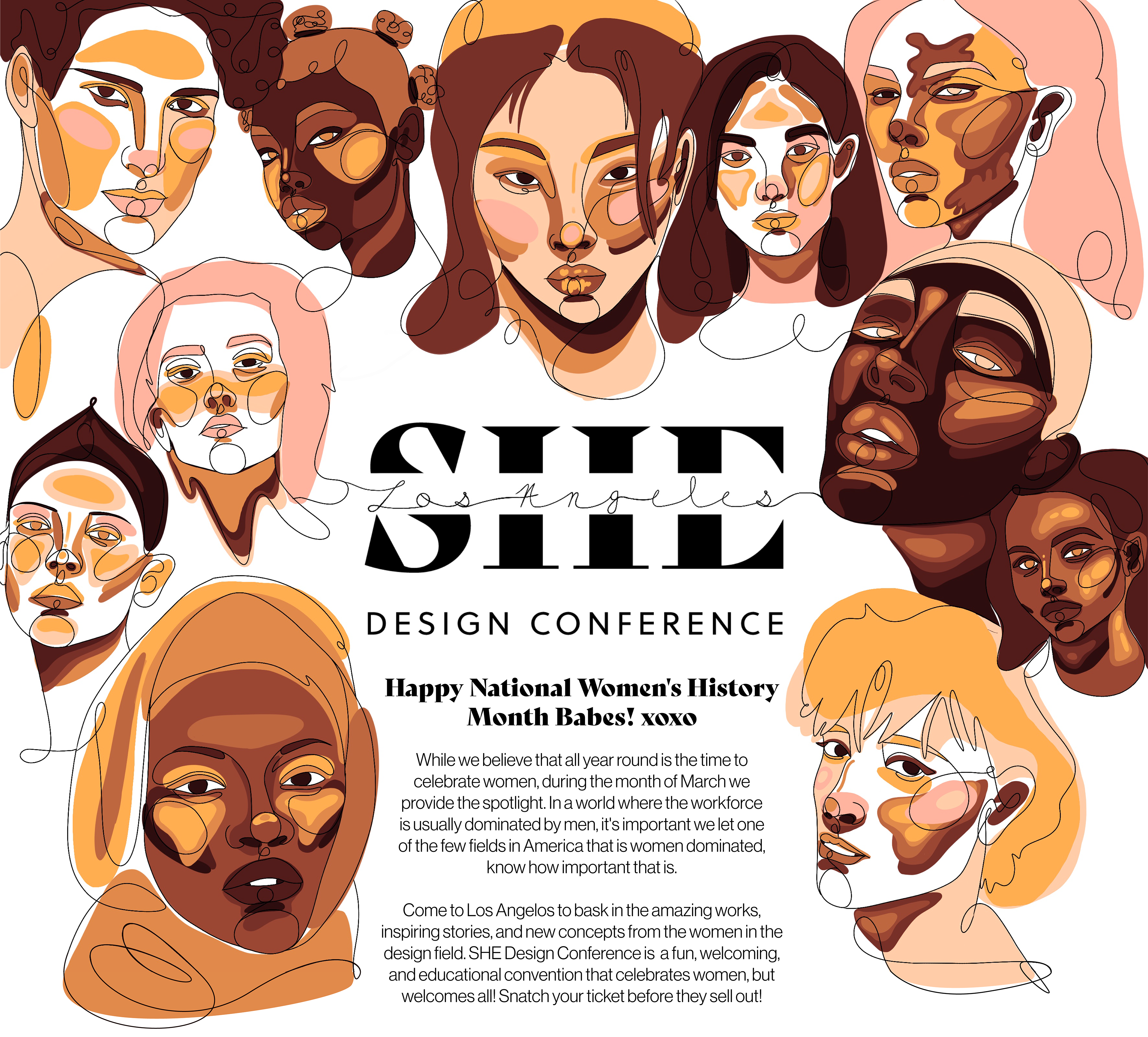
This conference specifically explores design systems, diversity/inclusion, and the economy through the lens of womanhood. Let me take you through my process before we tour the conference!
Discovery
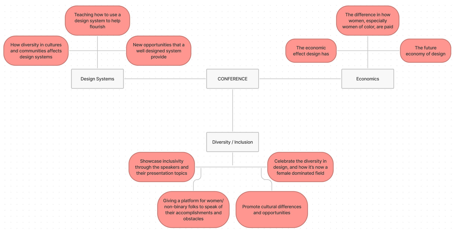
Conceptual Mind Mapping
Women have a unique view in the workforce and world, I wanted to create the opportunity for them to use their voice. These categories allow for deep and surface discussion that could interest the various people attending.
sneaky
Thumbnailing
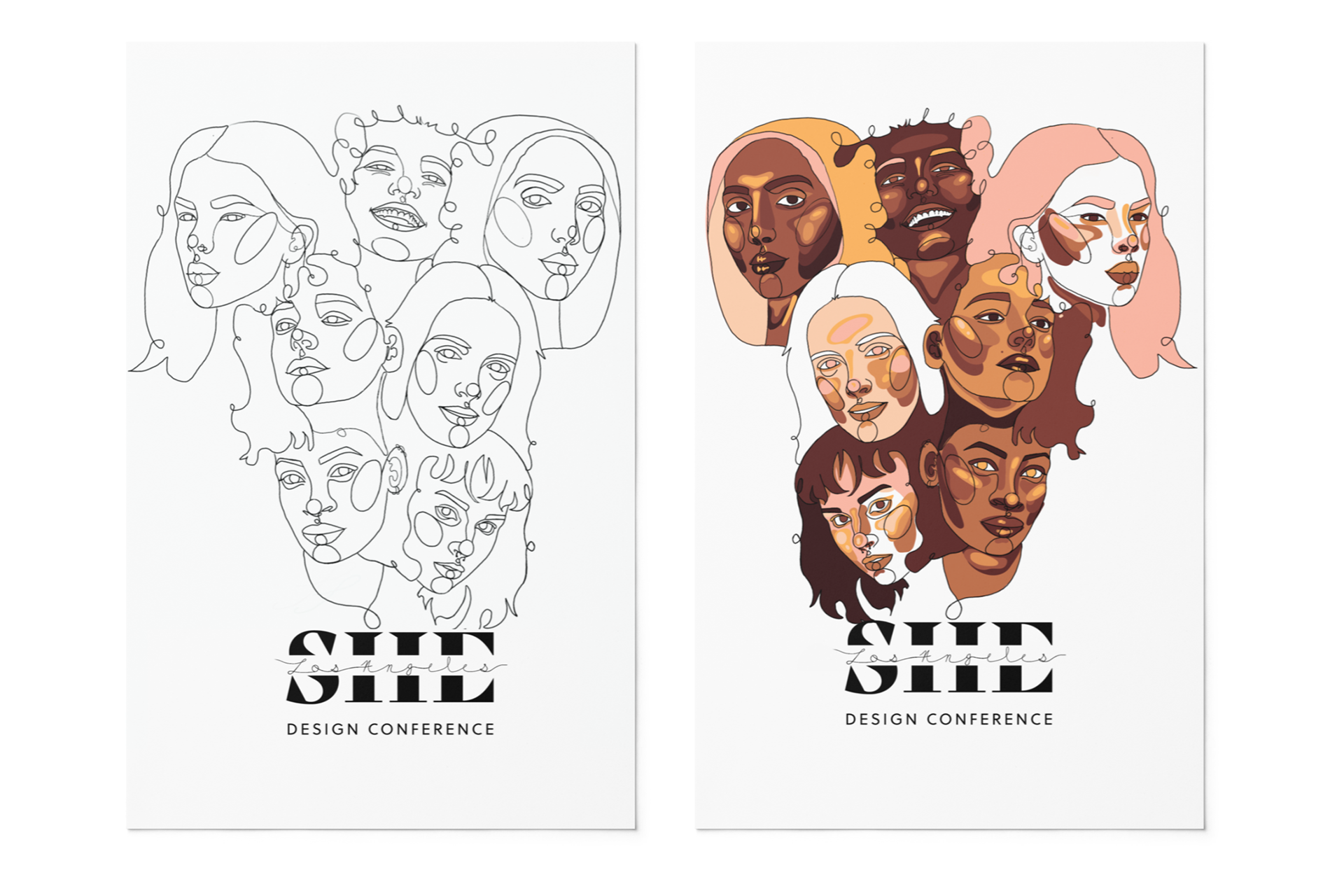
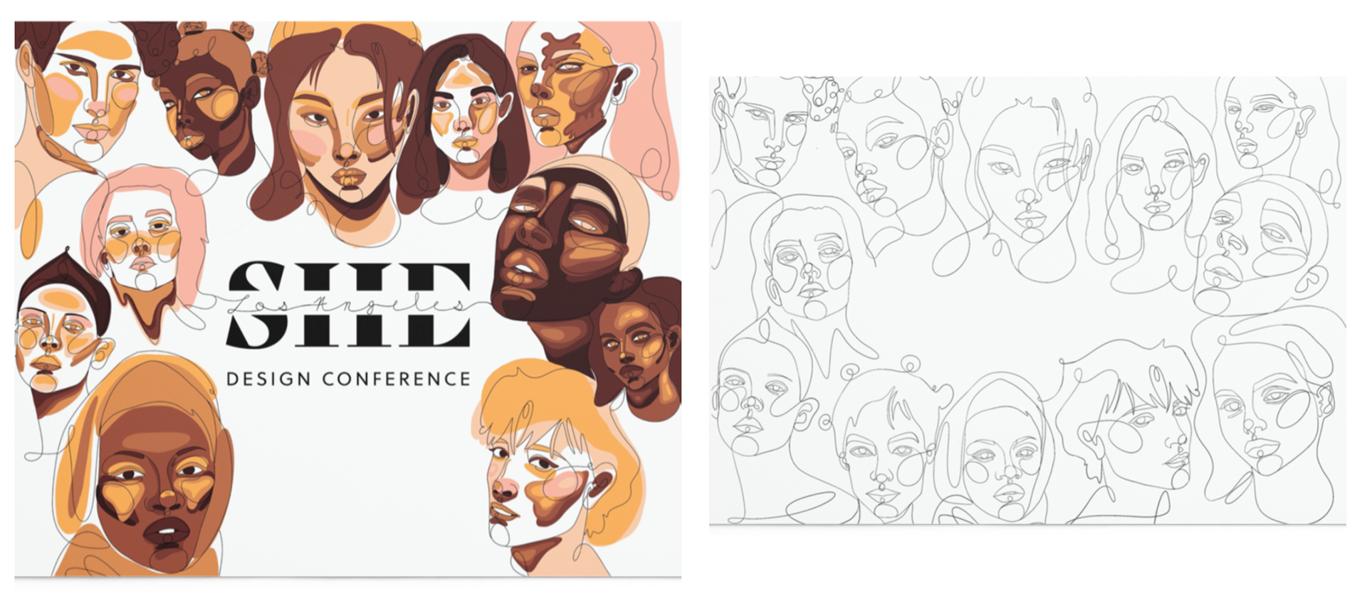
I explored with shapes and symbolic symbols that are associated with women (lotus flower, three moons, and the Venus symbol) however, the continuous line drawing provided a less abstract solution to what was trying to be portrayed:
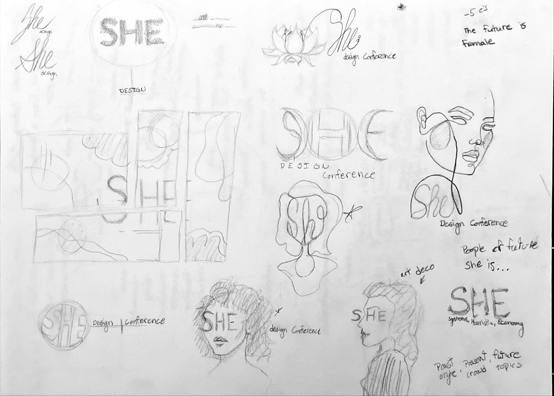
a conference dedicated to women, for women, and how we unite, grow, and inspire one another.
Branding
sneaky
Colors and Typography
For more decretive type, the typeface "Bely Display" was used. It's bold yet elegant to resemble the women we're celebrating, and "Soleil" is a nice complimentary type to accompany it.
sneaky
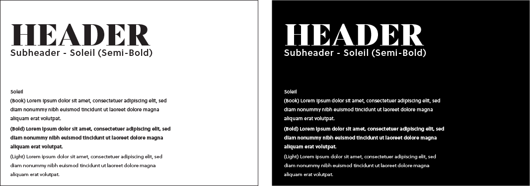
Typography Choice
Color Palette
sneaky
Defining gender by the binary colors didn't represent what the conference was portraying; we're celebrating women, not femininity. It also felt too on the nose.
A warm skin tone palette provides a fun groovy palette and everyone is included by not defining gender.
Poster
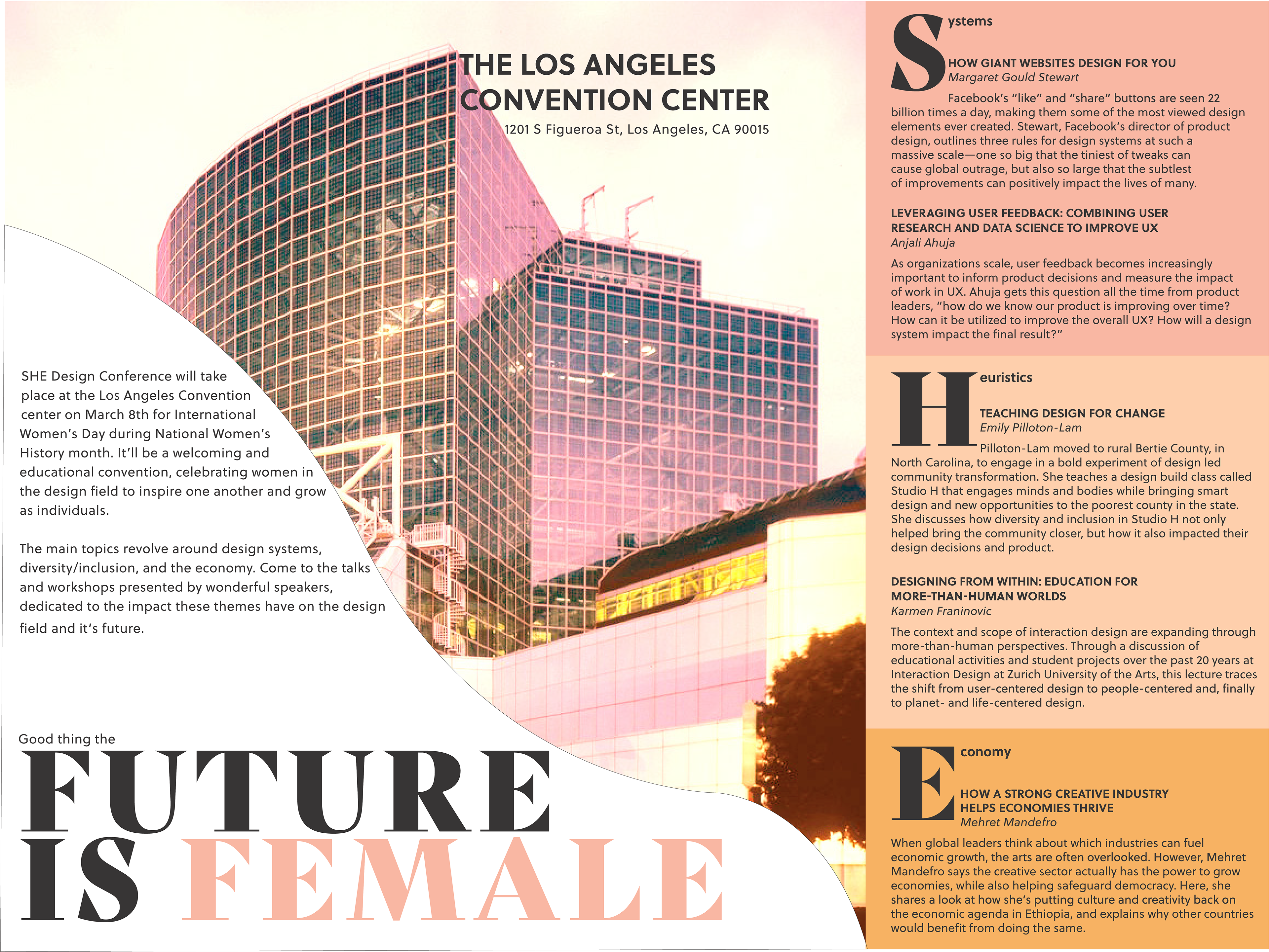
The poster that the attendees receive, show what the conference is about. Highlighting the main talks and their speakers, the venue layout, a schedule, as well as places to stay, eat, and see in the Los Angeles area!
sneaky
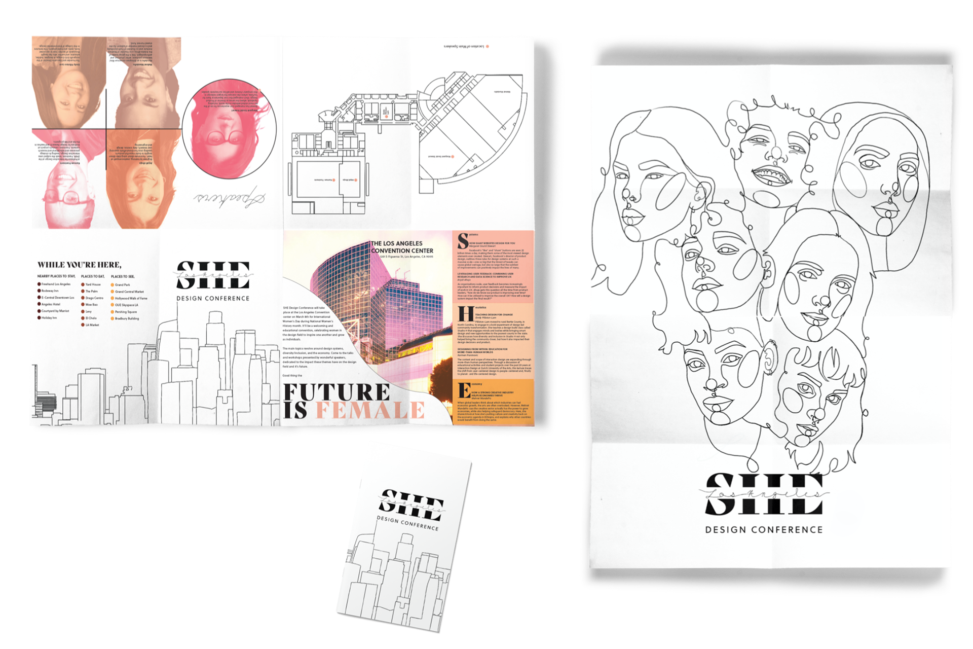
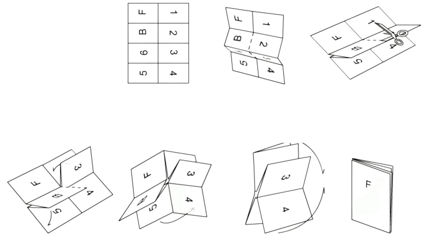
The poster is 18" x 24" when unfolded, and is folded in a booklet technique, demonstrated here. This way every pamphlet from the conference is also a souvenir.
Speakers & Talks
sneaky
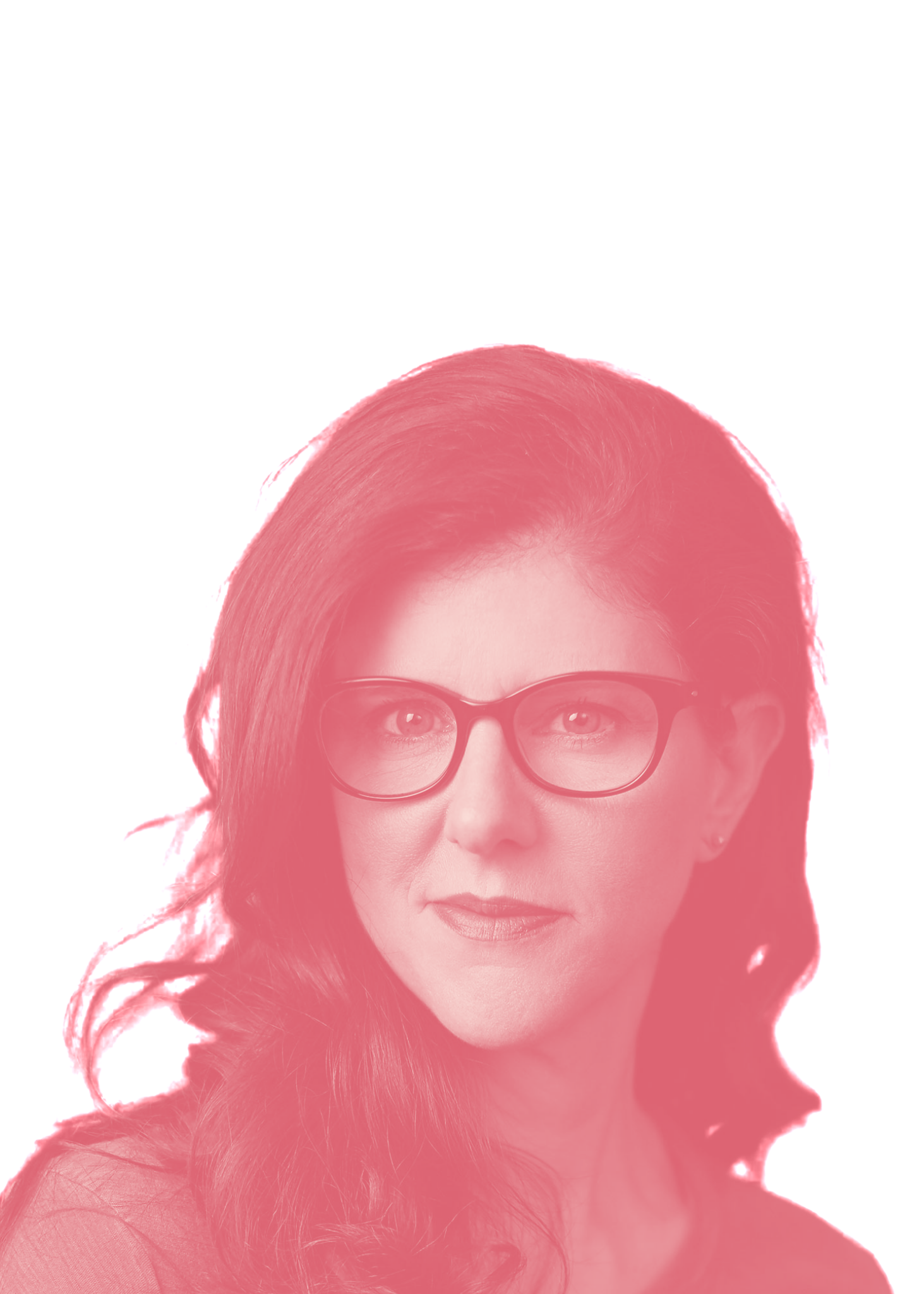
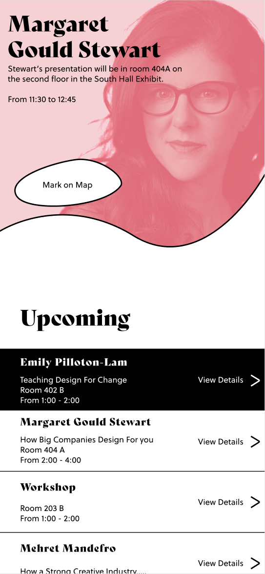
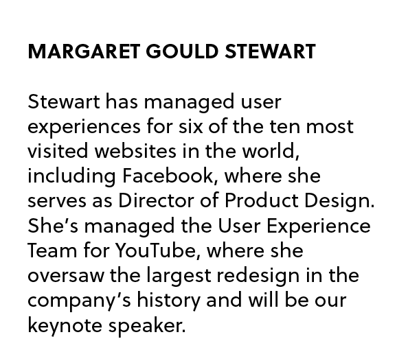
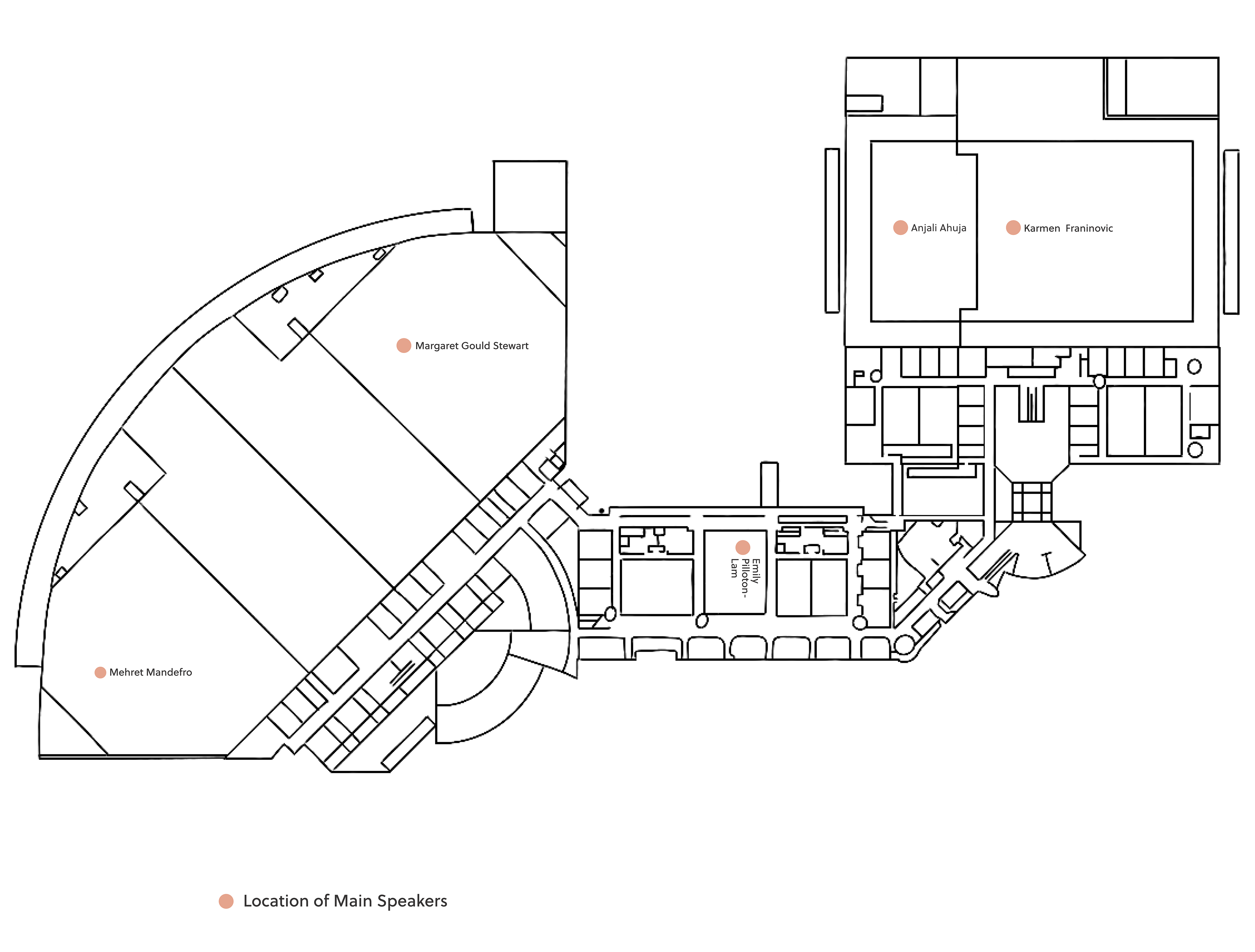
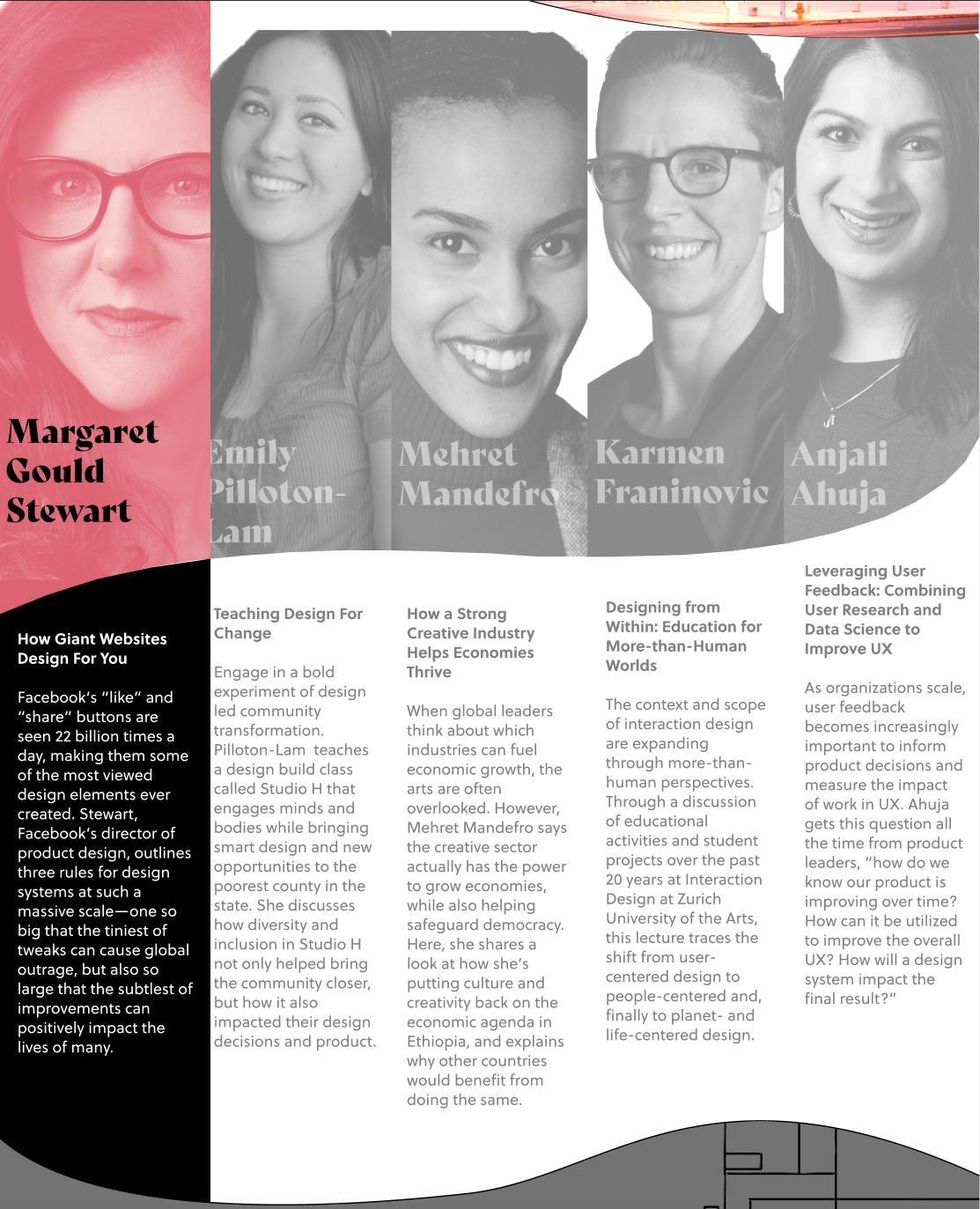
Margaret Gould Stewart
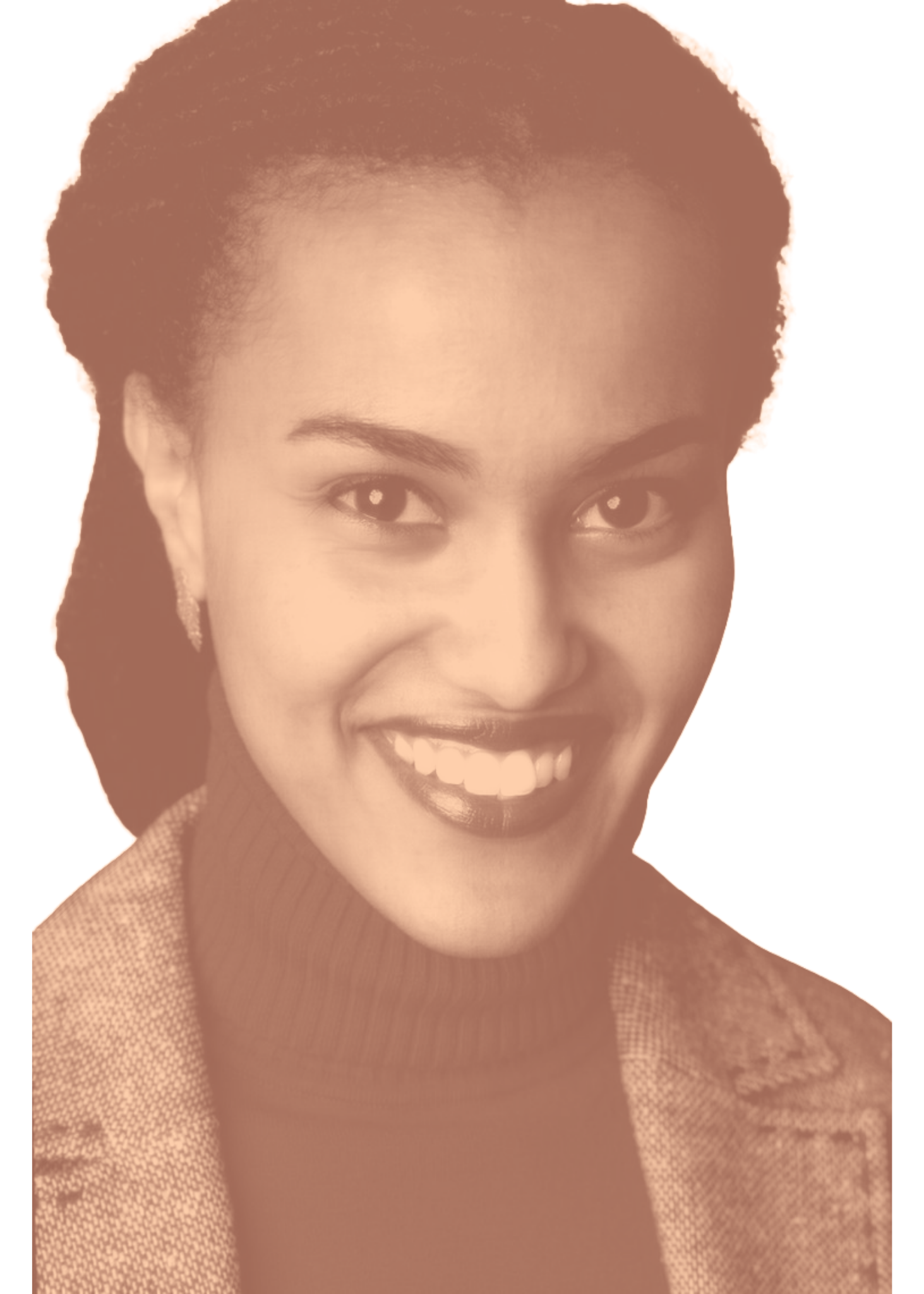
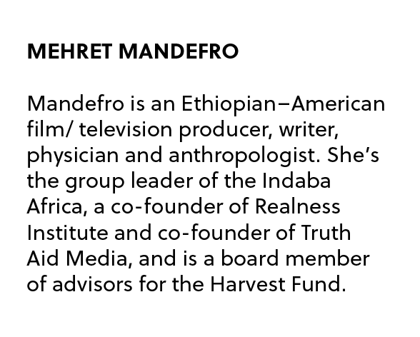
Mehret Mandefro Mandefro
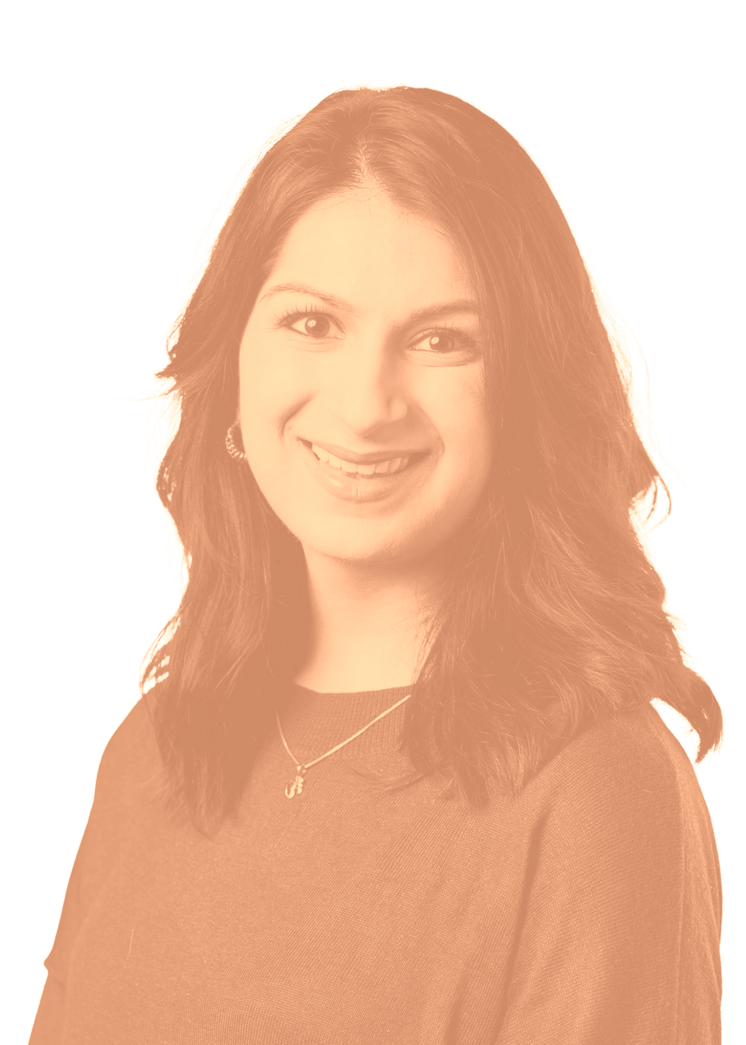
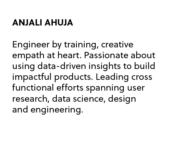
Anjali Ahuja
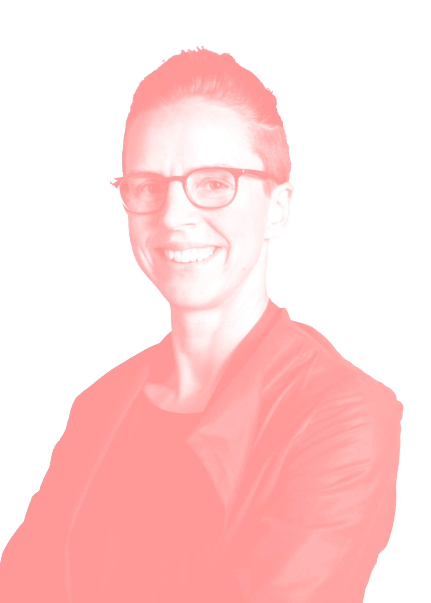
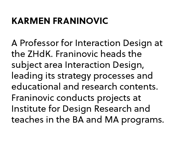
Karmen Franinovic

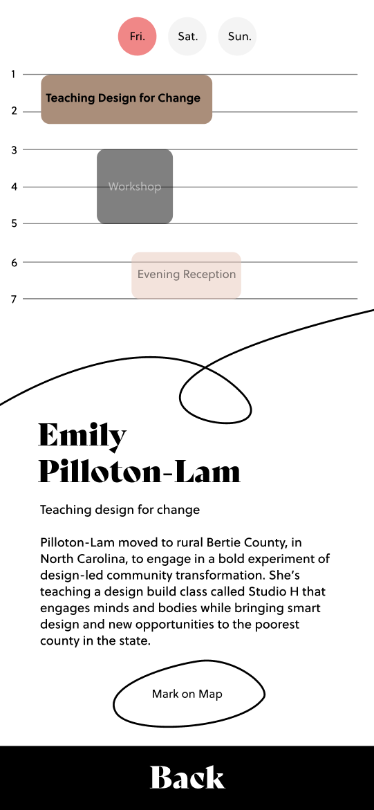
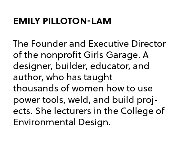
Emily Pilloton-Lam
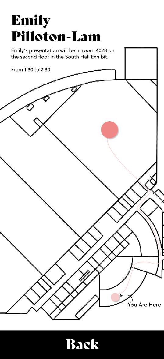
Venue
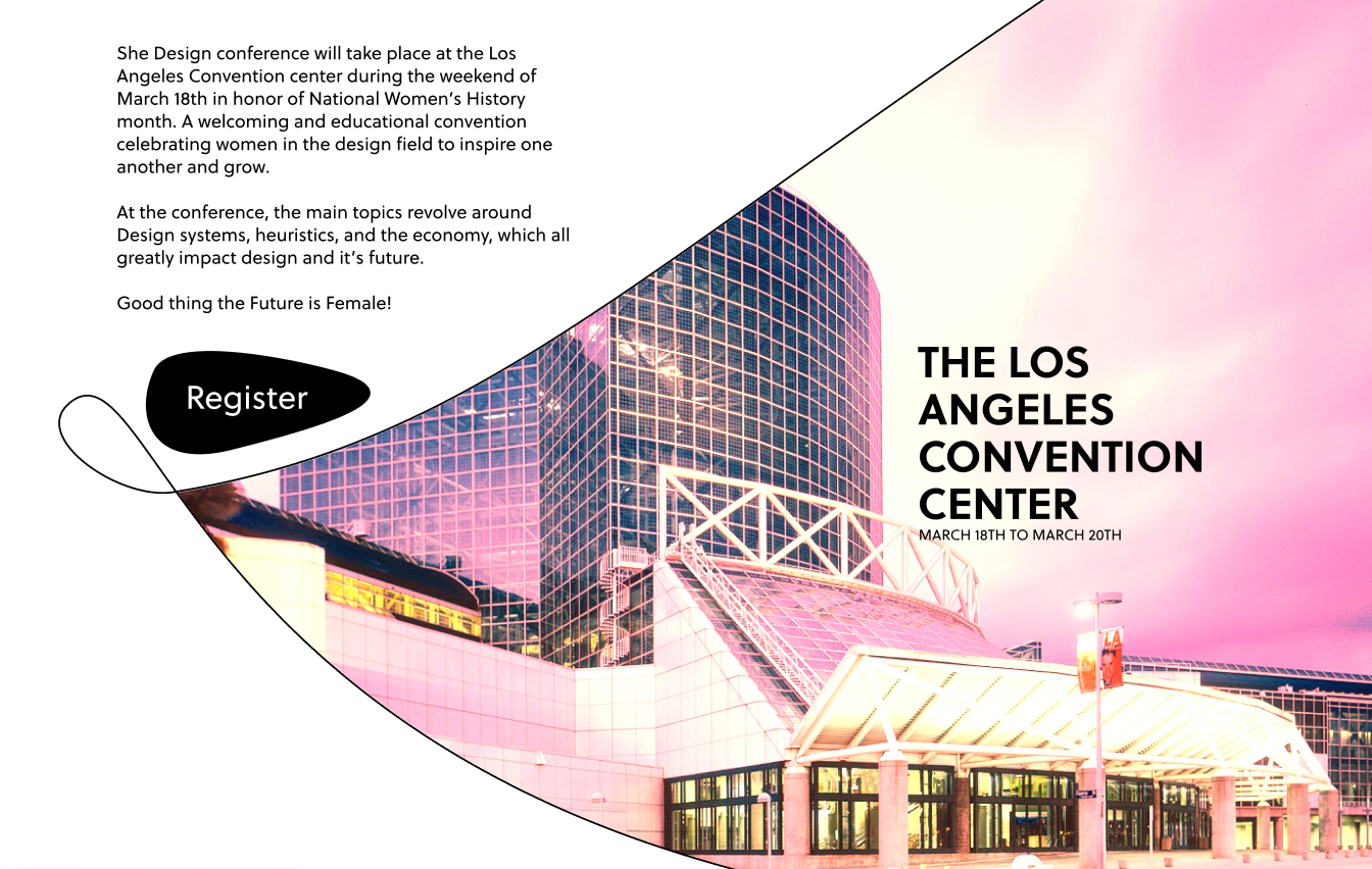
The Los Angeles Convention Center stands in the southwest section of downtown Los Angeles. This venue was chosen because of it's location, events, and architecture. It's known for hosting large annual conventions and major events, and therefore has several rooms, stages, and theaters that are perfect for the conference.

Environmental Touchpoints
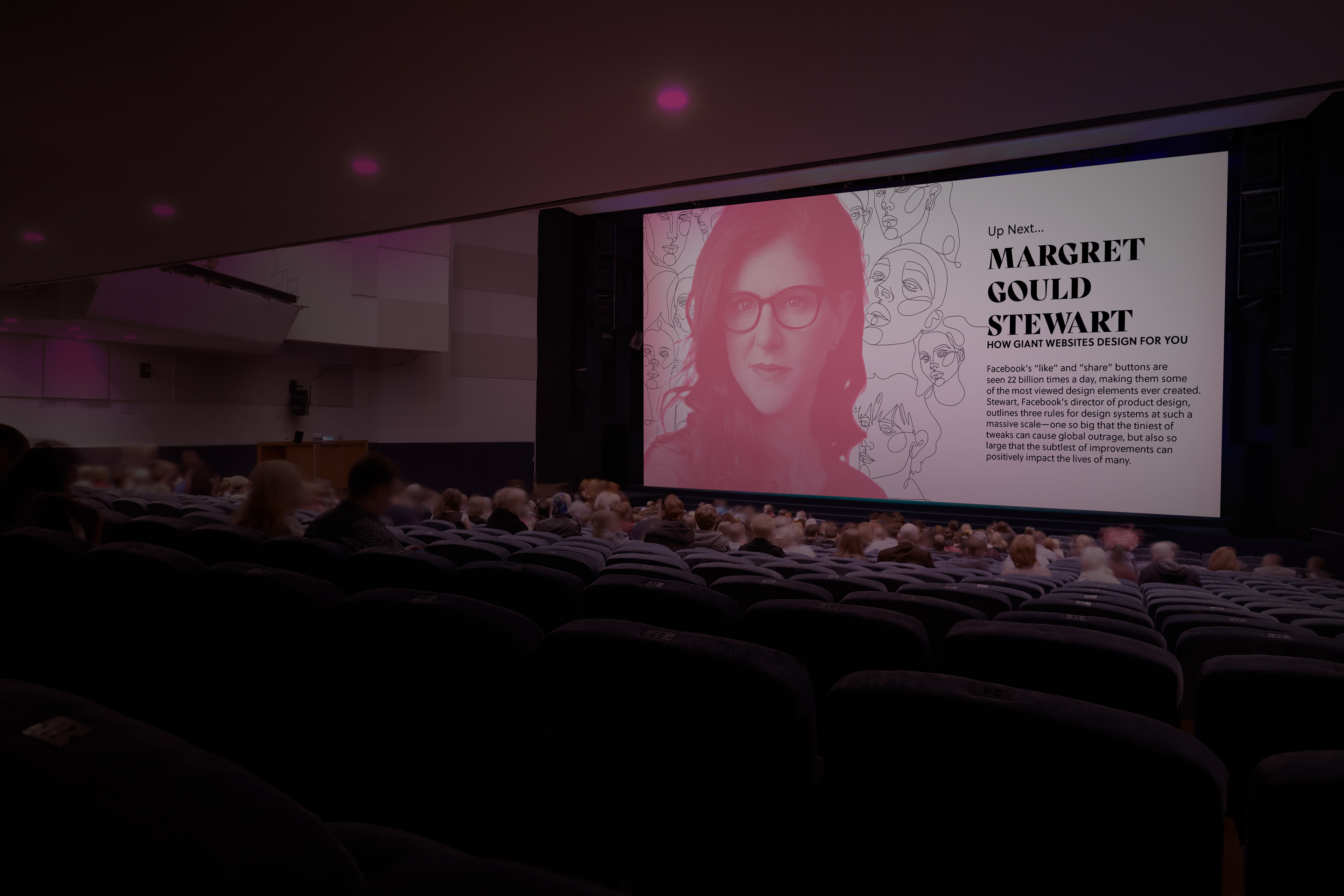
Mock-up of presentation screen
The two different fold up poster designs.
Other prints/posters.
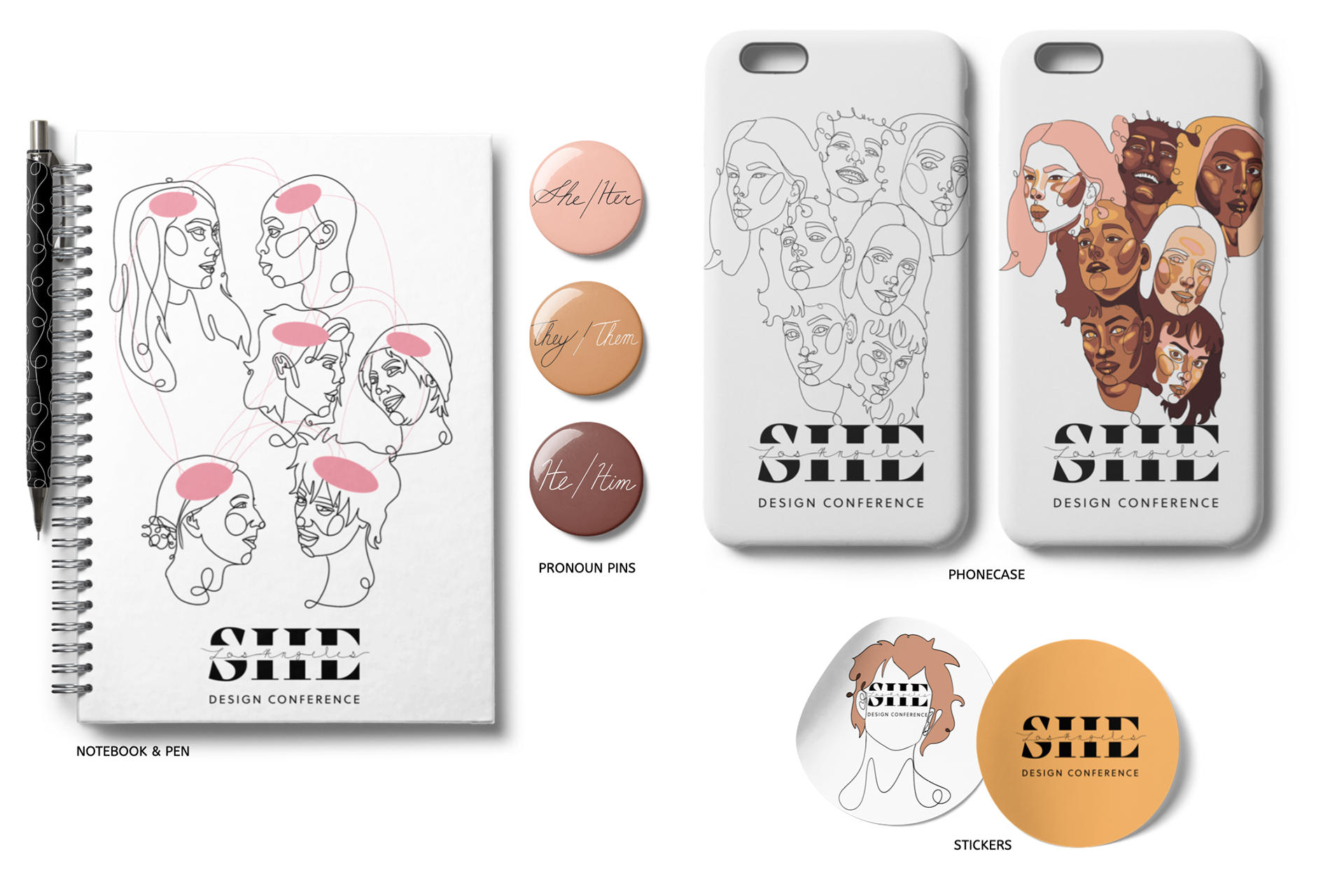
Keepsakes
Digital Experice
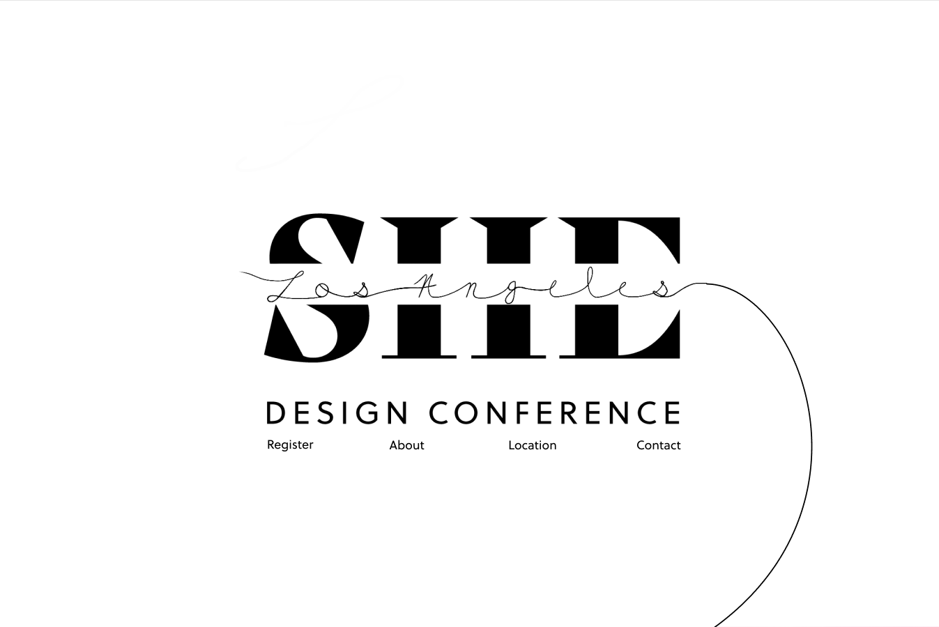
Website

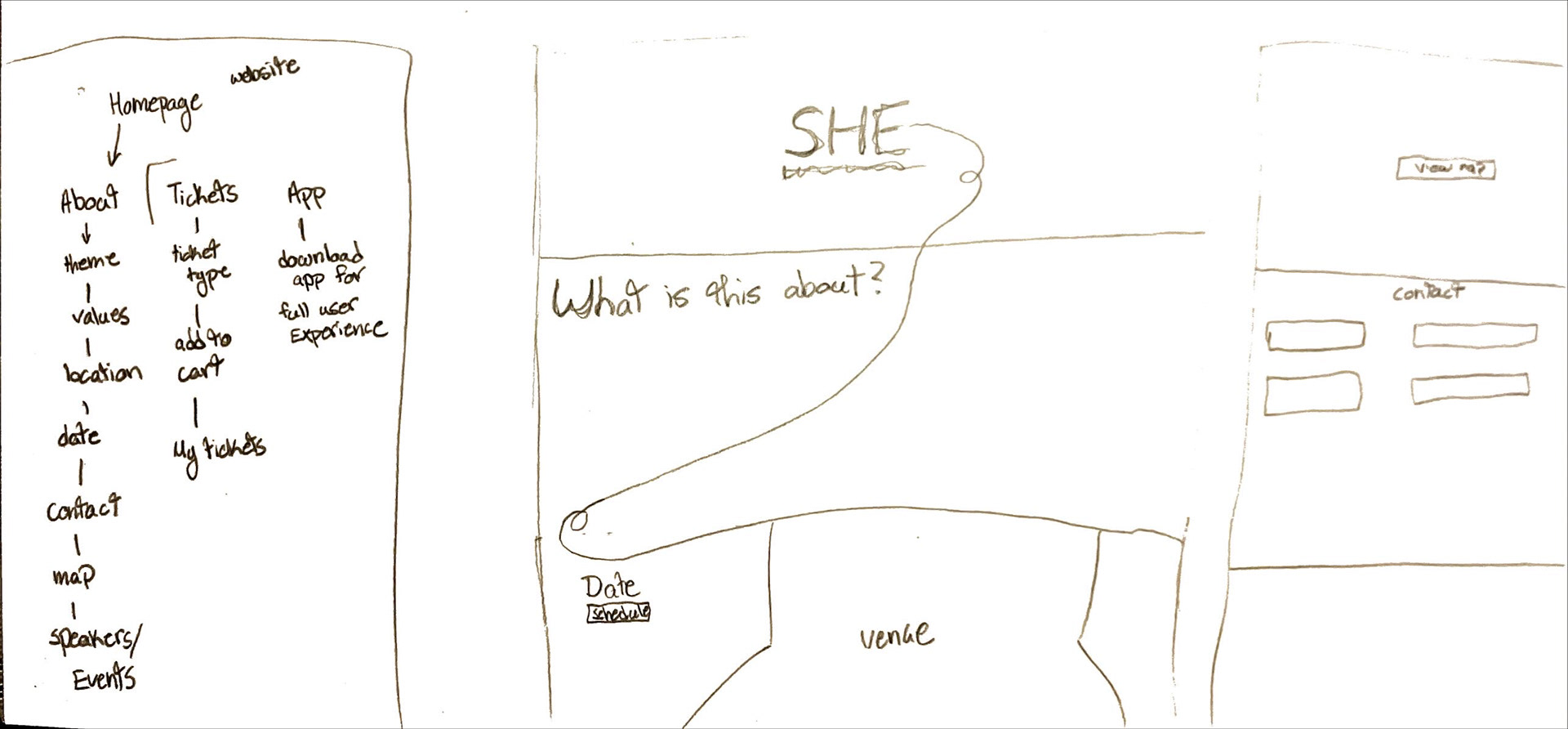
For the website, I made a continuous scrolling homepage to match the style of the conference.
sneaky
EE
Motions on the website would include:
The line following the user's scrolling,
Hovering over the speakers will expand/highlight the info.
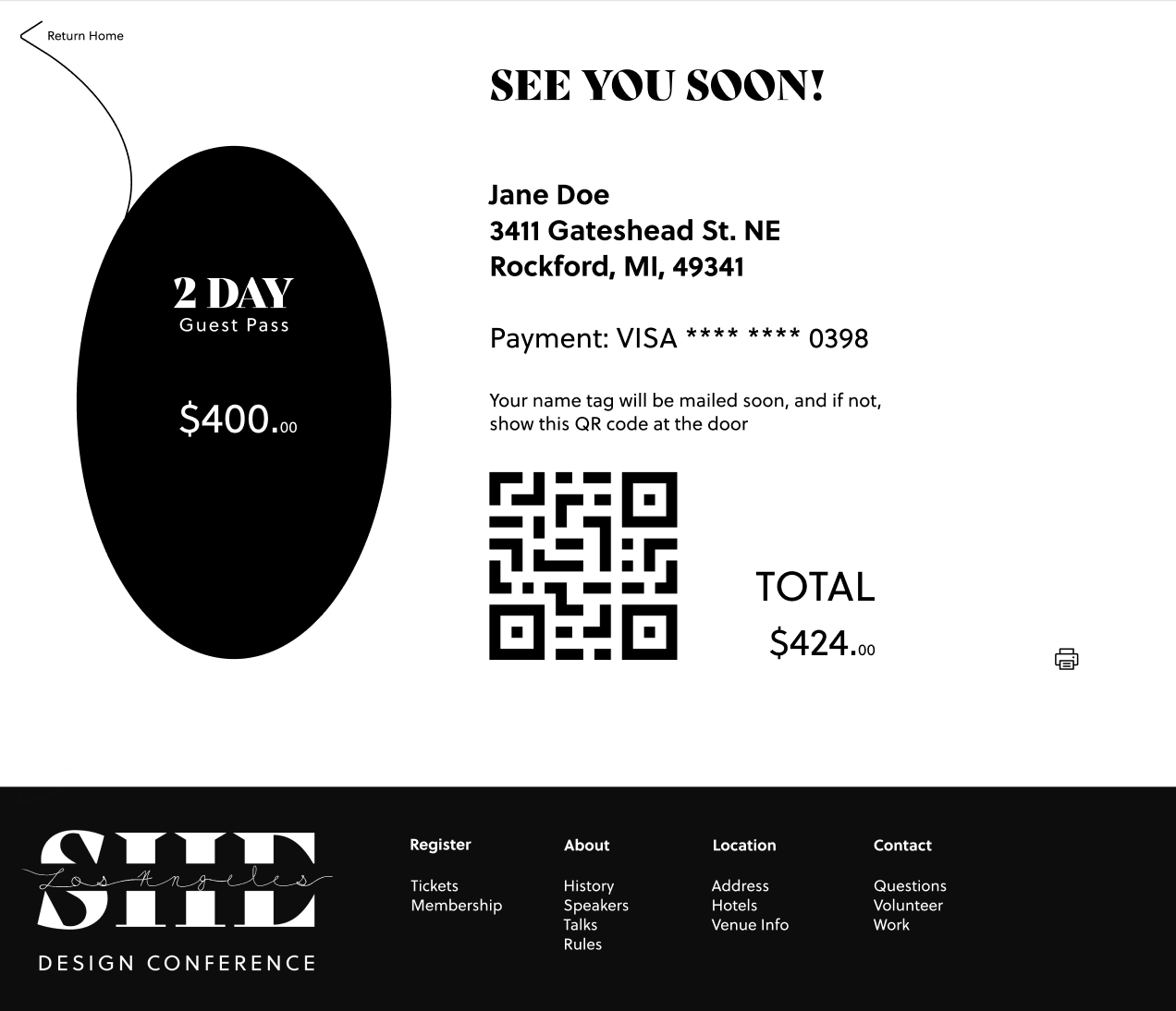
This was how I continued the line onto the ticket purchase and confirmation screens.

App
An app was created for the conference simply to improve the user's experience, but is not necessary.
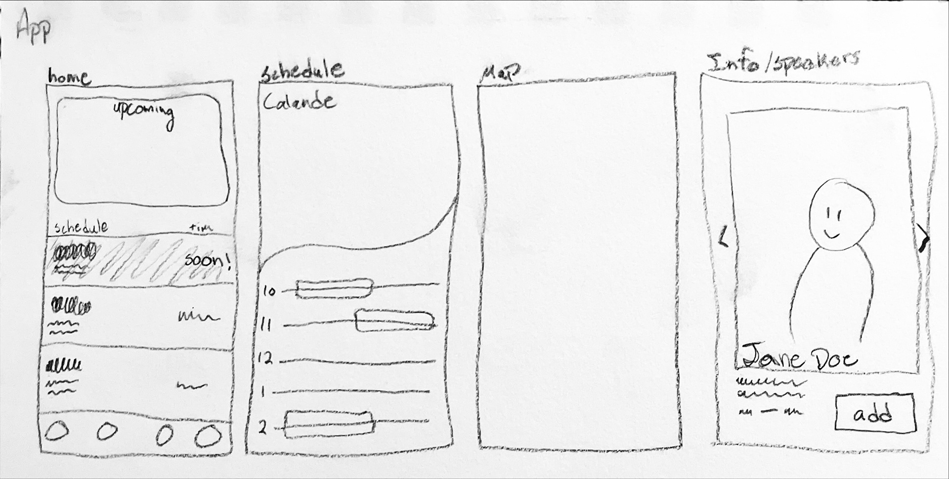
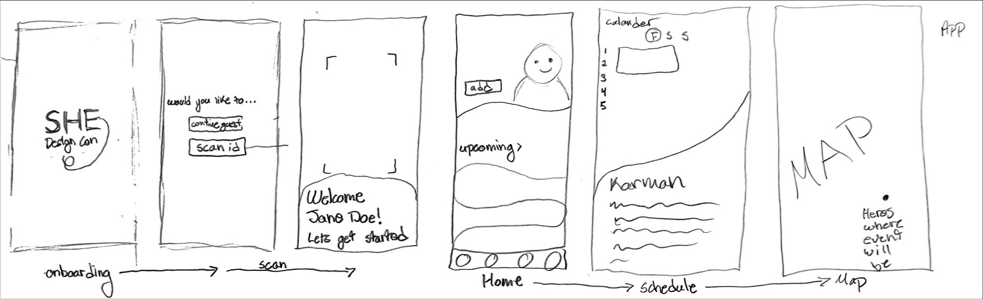
The Los Angeles Convention Center is a large venue with lot's of rooms, and reviews of the venue said that there were weak connection spots and sometimes unreliable wifi in general.
If a wifi connection cannot be obtained, the user can use the app to help navigate the venue and have a digital schedule!