For this editorial assignment, we were given 10 articles based around food, and had to choose 5 to become spreads. Everything besides the text of the articles and photos credited, were done by me.
Branding
First things first: the identity of my food magazine.
Cooking was a big deal in my family growing up, and we had a billion cook books, scrap books, a recipe box, a recipe folder, and random pieces of paper with recipes on them covered the fridge.
That familiarity and cozy nostalgia was the feeling I was going to try and capture for this editorial. All the articles I chose were recipes, tips, and recommendations that would have been in my childhood kitchen; I wanted this editorial to feel like apart of the family, as if it was homemade. Ba dum tss.
Front
Back
With the cover, we had to be mindful of the idea that this
magazine would have several issues, and would have to
have a common style and theme....
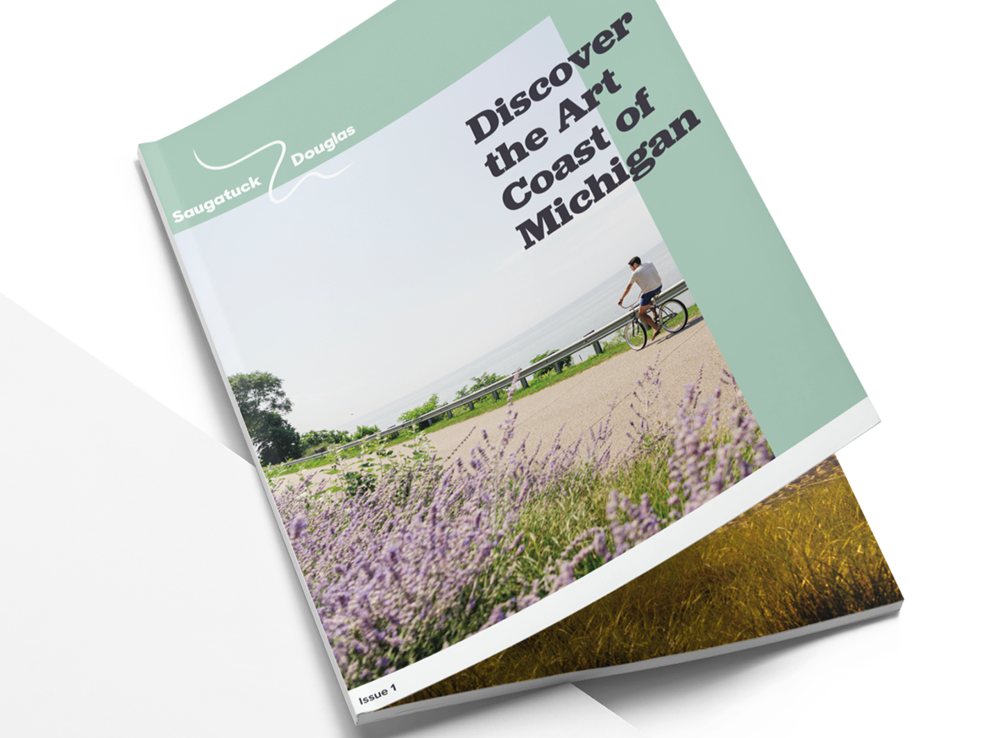
My thought process was a cookbook would be in the kitchen,
a magazine about food would be on a coffee table;
So I must create a cover worthy of being on the coffee table.
The layout and typography will stay the same, but the colors and illustration would change with each issue.
This editorial theme gave me an opportunity to be very creative and visual in different ways, each article has
a different personality that lives within this home, so to speak.
Inside Homemade
The main focus for the table of contents was matching the style of the cover. Readability is also rather important in a magazine, so I didn't want to clutter this spread by matching it with the individual articles style.
First Article
For this article I wanted to keep the childish/ "mommy lifestyle" look throughout the spread with the bright colors, illustrations, photography, and by using a lunch bag texture for the background.
Second Article
On this spread, I utilized the magazines gutter to smoothly transition the artwork of the squid, into the calamari the recipe teaches.
I wanted this spread to seem like the user's home; a quick "break" from the article to write down the recipe/tips on the cards.
Lastly, I wanted this to be a lot more straight forward and less conceptual to create balance, and to make this section a simple quick read. I took inspiration from other cook books, but added elements to make it match the rest of this article and branding.
Third Article
Old version of this spread
I wanted to fix the typography on this page. The text wrap on the cow felt awkward, and there was no hierarchy within the paragraph.
He looks cuter over here anyway.
Fourth Article
This article represents the user eating at a restaurant and opening the menu. It was also important to make sure that the "pairing basics" applied to the typography as well. I wanted clear hierarchy, and chose the decretive serif font with the clean and simple san serif font to portray that.
Fifth Article
This spread was all about history and tourism, so I went for a textbook/touring pamphlet style. This editorial overall was very image heavy, so I took the opportunity to play with typography and hierarchy with this article.


