We may not need to reinvent the wheel, but improvements have, can, and will be made. Such is the way of a products life; to be invented time and time again with improvements made each time.
Which leads to the problem:
Most yogurt companies have a very basic and simply structure for their product with small variations between them. Yoplait has a slimmer and taller container, whereas Oikos has a shorter and fatter container.
This container that we've become accustomed to however, presents three major problems: lack of shelf presence, a harmful environmental impact by using single use plastic, and the actual mechanics of the container not evolving.
So, what's the solution?
Redesign Chobani singles in a way that positively reflects their brand and allows consumers to obtain the maximum amount of product from their purchase.
To address the problems found throughout the process, we would need to change the material, the shape, and lid of the container.
Identify
To find the problems and the users that use Chobani products, Katie Shantz and I went to Meijer to interview those in the yogurt section.
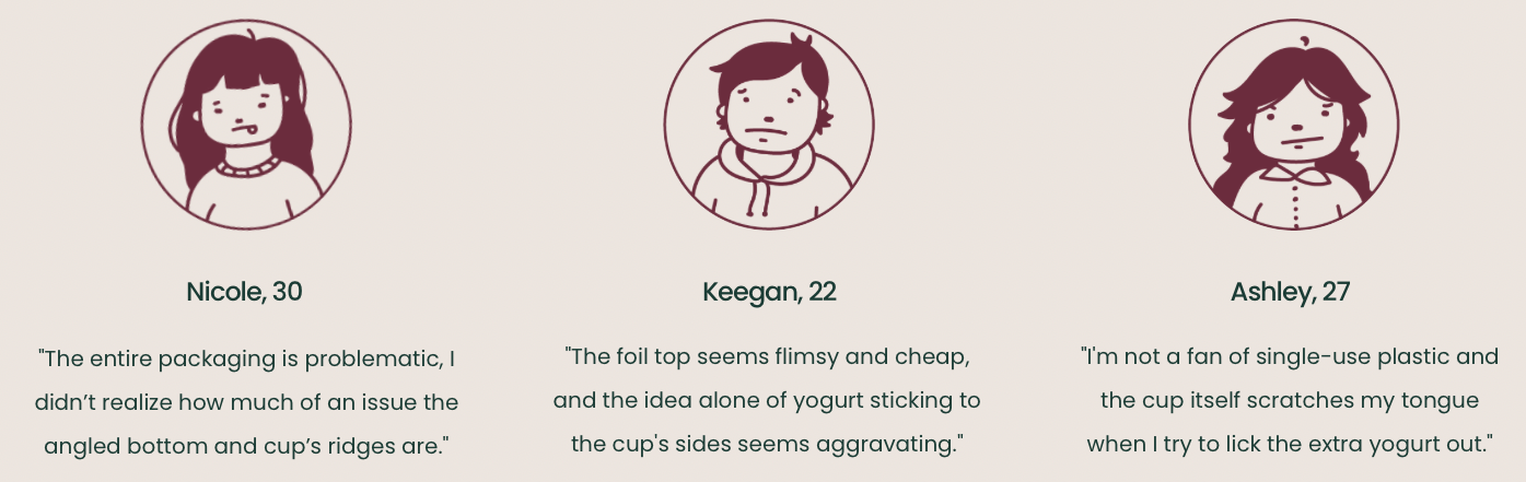
Illustrations done by Katie Shantz
We also sent out a survey which got 64 responses to help gather further insight on the issues with Chobani's packaging. We found...
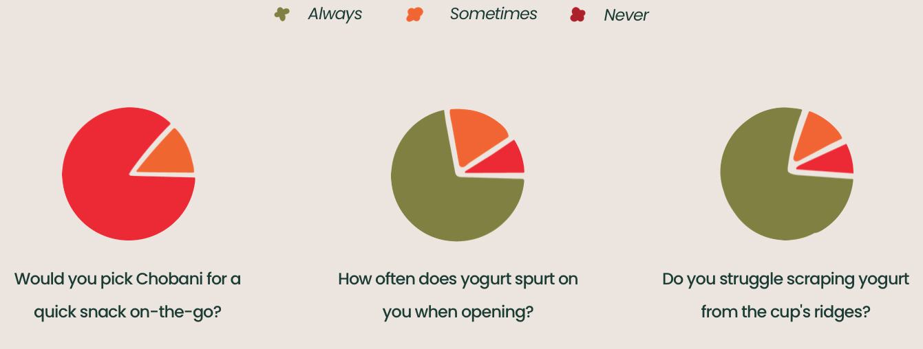
Here's what we discovered...
Issues
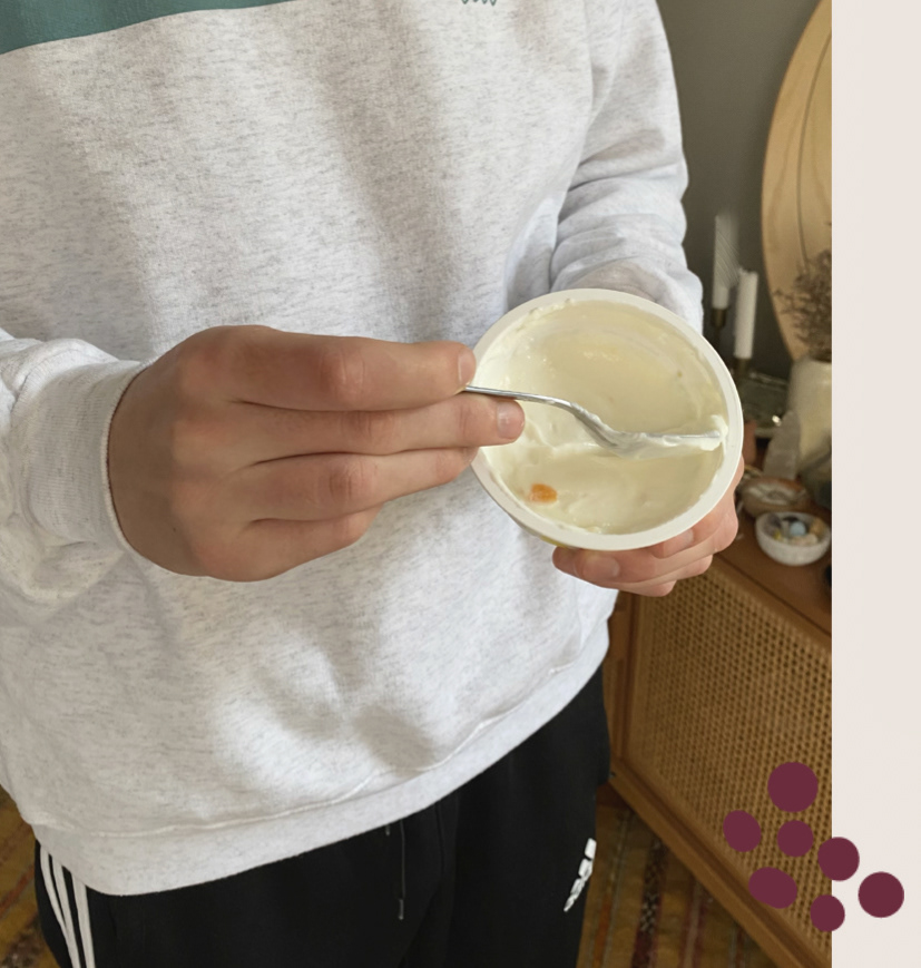
- Difficulty scrapping yogurt out due to hard edges
- Yogurt spurting upon opening from built up pressure
- Single use plastic container
User
Archetype: Well-ness focused millennials looking for
Functionality to make consuming the product easier.
Aesthetic Appeal shows the consumer what the brand stands for.
Product Afterlife and how it affects the environment.

Discovery
Competitive Landscape
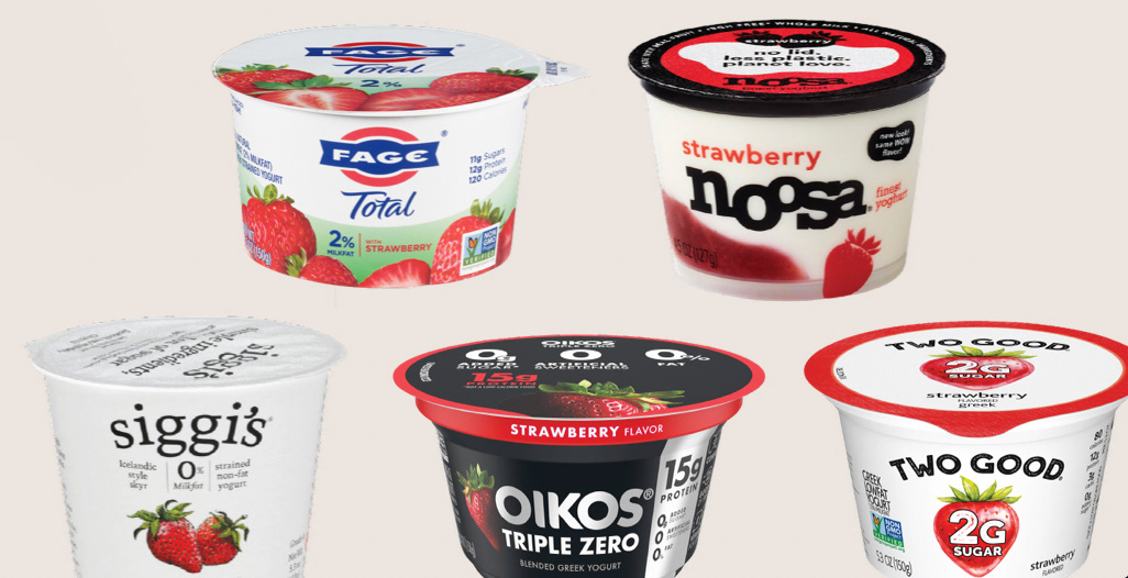
Other Greek yogurt brands that also prioritize health considerations and social consciousness are: siggi’s, noosa, and FAGE.
We wanted to take a closer look at Chobani's competition to see what they're doing right, and what they aren't doing at all. Although each container and label is unique to each brand, they all blend in with one another.
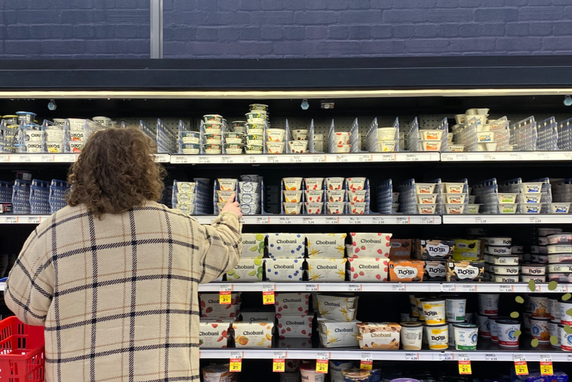
PDP Audit
Chobani debuted their rebrand in late 2017, now featuring a curvy and organic font, matte packages, and illustrations of fruit that look like they’re painted rather than photographed.
However, when positioned near other Greek yogurt brands, Chobani still struggles to stand out.
Best Practices
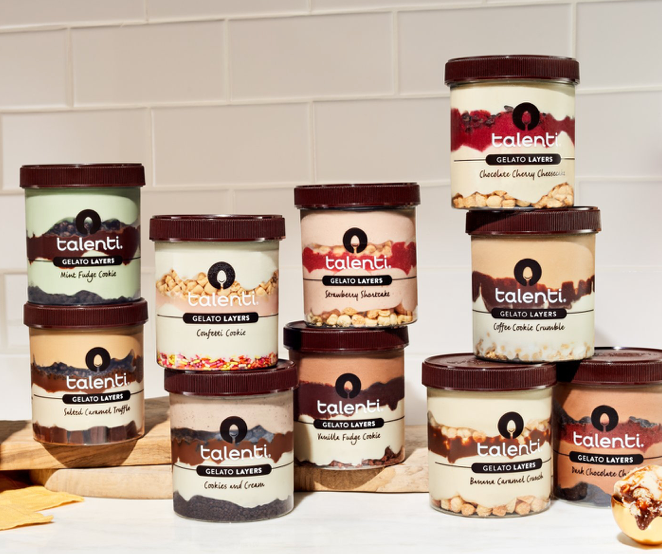
Talenti is an American gelato company that believes the best process results in the best gelato and sorbetto.
Talenti’s packaging features a clear container that showcases the layers and freshness of their product, making the product itself apart of the branding. This aligns with our objective.
_________________________________________________________________________
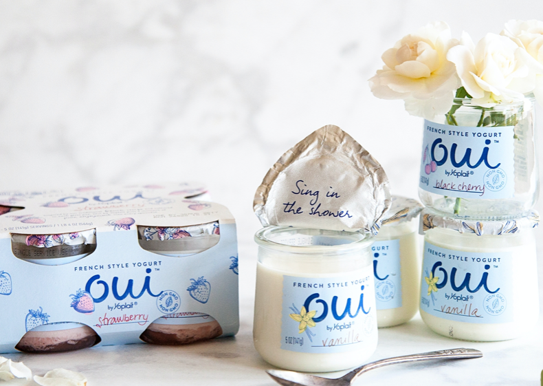
Oui is an American company that makes French yogurt.
Oui utilizes a glass container that can be reused, while also protecting the integrity of the yogurt’s texture during the production and shipping process.
Planning
Moodboards
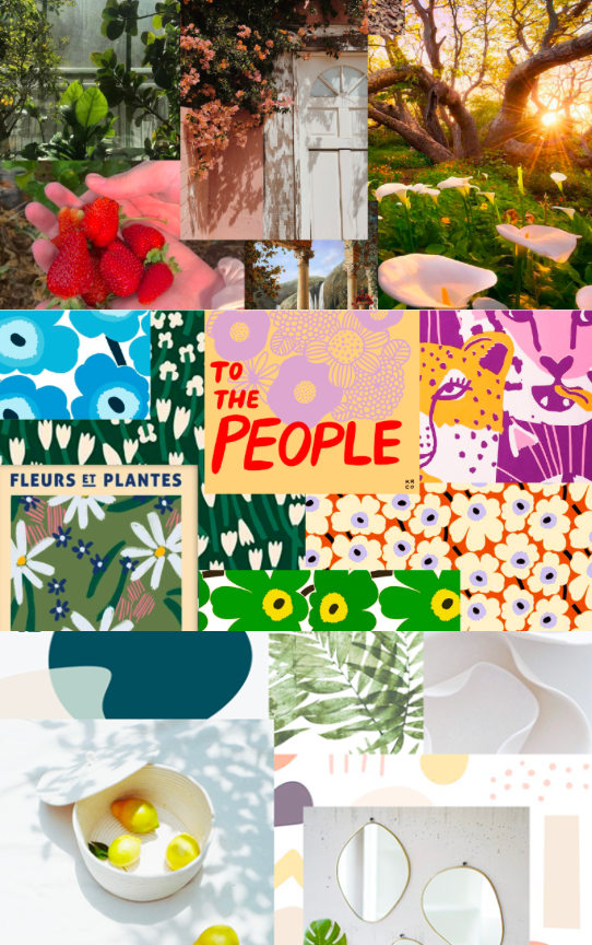
Since Chobani rebranded, we really wanted to incorporate their changes into the new packaging as much as possible. To do that we created three moodboards:
Whimsical with their approach on how food nourishes the soul and can be a romantic experience.
Humanistic in how they use a chubby serif typeface, illustrations, lush photography, and softer colors.
Organic in their shapes and illustrations that showcase and represent their fresh ingredients.
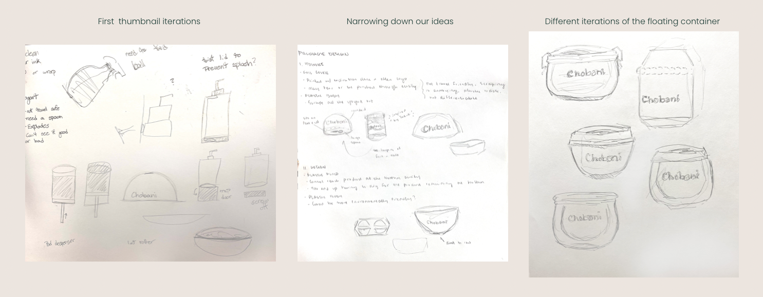
With the problems and objectives in mind, and Chobani's branding under our belt, it was time to sketch out the ideas before picking and finalizing the design. We explored a "push pop" method, the "snowglobe method", and even a pump bottle idea.
Through several rounds of thumbnailing and testing, we eventually landed on the "floating cup" model. This would showcase the product, and have it appear as if the yogurt is suspended within the cup.
Prototype

Preliminary Model
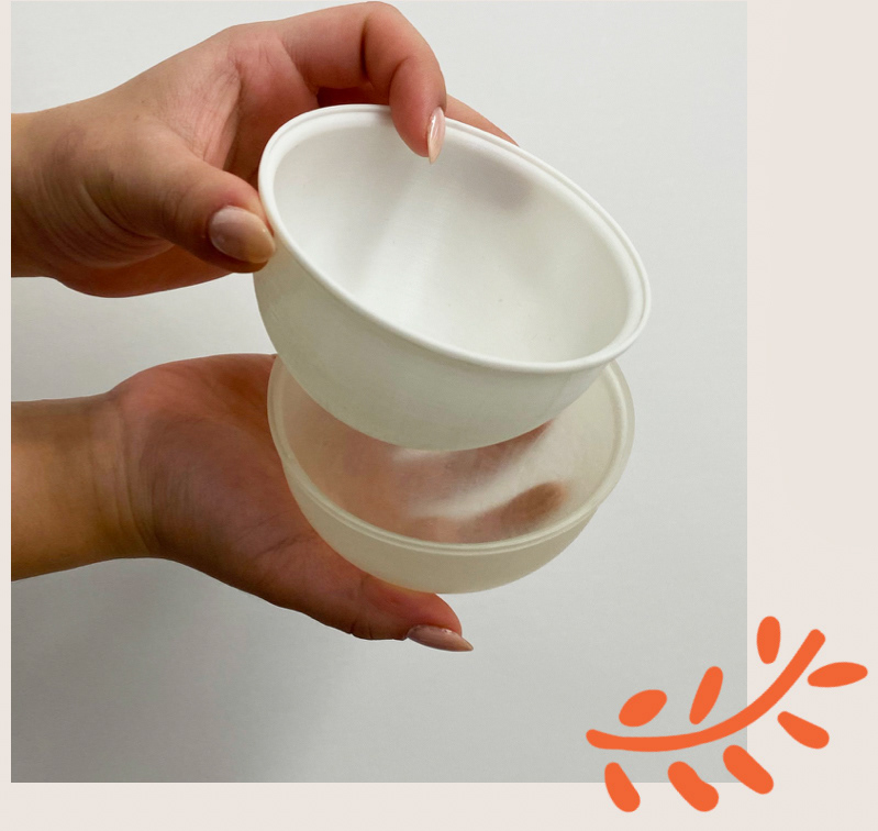
Our first prototype that we created was made from a soda and slushy lid. We were able to demonstrate the desired round shape for the cup, with a flat bottom so it can still sit upright.
However, one of our biggest objectives was eliminating hard edges on the container. A flat bottom defeated that purpose.
First Model
Our first 3D model was printed by our partner Joel, which presented a glaring issue: You can’t set it back down once it’s opened.
We then created a second model we called "double cup".
The plan was to have an inner cup that was completely round, and an outer layer to that cup that would be flat at the bottom. With a clear material, it would appear as if the yogurt was floating.

Solidworks
Then Joel took our critiques and drawings to create this new 3D model. It has a completely rounded and smooth inside to compliment the spoon, and has a screw on lid rather than an aluminum lid to prevent the pressure build up resulting in spurted yogurt.
Joel never got around to 3D printing the model sadly.
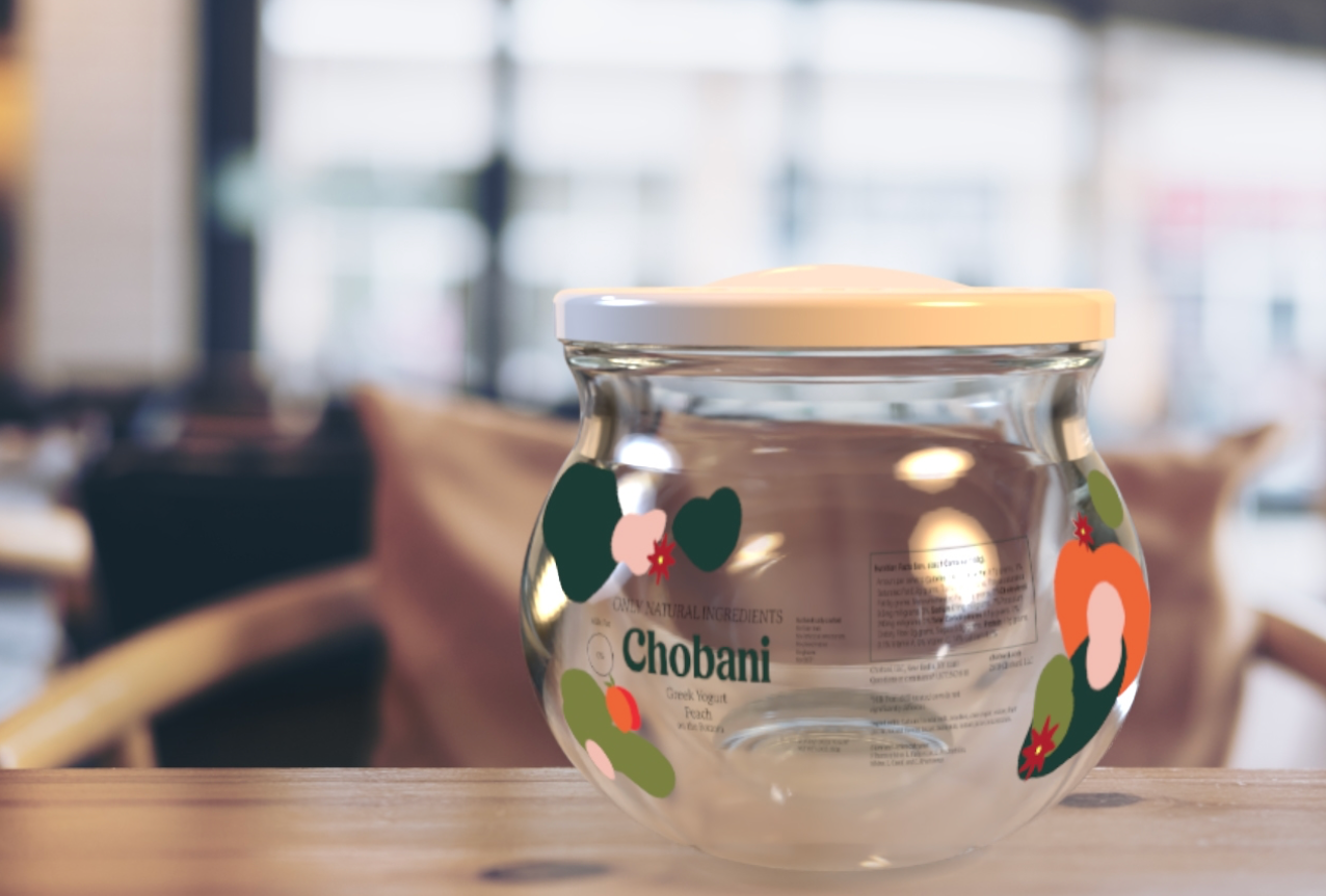
Final Mockup
With the double cup model in mind, we changed the material of the container to be a thick glass to accommodate not just our survey results, but to further incorporate our best practices. This also made it so that we only had to create a single object rather than two objects stacked in one another.
Final Test
We went back to Meijer to test and show our new packaging to yogurt customers. When we arrived we found Darla and Garrett
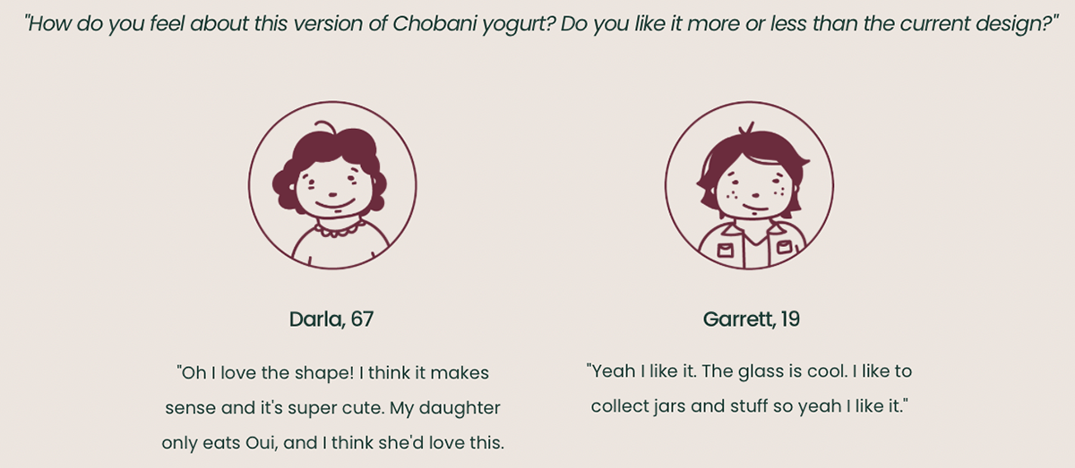
The problems in Chobani's packaging were their uninspired container and their environmental impact. Smoothing out all edges and adding the screw on lid not only makes Chobani stand out, but benefits the user experience, and by switching the material they used, their environmental impact now compliments their branding.
With the people of Meijer's blessing, our repackaging for Chobani is finished.
For now....